The Role of Energy Dashboards in Optimizing Your Energy Use
- 1 hour ago
- 9 min read

TL;DR:
Energy dashboards convert raw meter data into actionable insights vital for managing rising energy costs and sustainability goals. They track KPIs, trigger alerts, and support automated responses, but face interoperability challenges across Europe’s varied smart meter standards. Effective implementation requires goal-based selection, phased data integration, user training, and attention to data access to maximize savings and environmental impact.
Most people assume an energy dashboard is just a prettier version of your electricity bill. It isn’t. The real role of energy dashboards is to turn raw meter data into decisions you can act on today. With energy prices across Europe climbing and sustainability regulations tightening, having visibility into exactly what you’re consuming, when, and why has moved from nice-to-have to genuinely necessary. This article breaks down how dashboards work, what they actually do for homes and businesses, where European deployments run into trouble, and how to get the most out of one.
Table of Contents
Key takeaways
Point | Details |
Dashboards do more than display data | They track KPIs, trigger alerts, and support automated responses that reduce waste in real time. |
Data integration is progressive | Start with grid consumption data, then layer in solar, battery, gas, and water for a fuller picture. |
EU interoperability is a real barrier | Fragmented smart meter standards across member states complicate dashboard deployments for vendors and users alike. |
Sustainability and cost tracking go together | Modern dashboards report carbon emissions alongside kWh and cost data, supporting both financial and regulatory goals. |
User engagement determines outcomes | A dashboard no one checks or acts on delivers zero value. Training and clear KPIs close the loop. |
The role of energy dashboards in modern energy management
Think of an energy dashboard as the interface between raw sensor data and the humans who need to act on it. At its core, how energy dashboards work starts with inputs: smart meters, submeters, IoT sensors, inverters, battery management systems, and building automation controllers. All of these generate continuous streams of data that a dashboard aggregates, normalizes, and presents.
Data arrives at different intervals depending on the source and use case. Grid consumption data typically updates every 15 minutes in line with standard meter intervals, while sensor-based systems can push data in near real time. The dashboard processes this into visualizations: line charts for consumption trends, bar charts for period comparisons, KPI tiles showing demand peaks in kilowatts, and cost totals in euros.
The importance of energy visualization goes beyond charts. A well-built dashboard surfaces the metrics that matter to specific users. An operations manager needs peak demand figures and anomaly alerts. A finance director wants cost per unit and budget variance. A sustainability officer tracks carbon intensity in kg CO2 equivalent. Multiple stakeholder views, each with the right refresh rate for their decisions, are what separate a useful dashboard from a decorative one.
Pro Tip: Before choosing a dashboard platform, list the three decisions you need to make each week based on energy data. If the platform cannot surface those answers within two clicks, it’s the wrong tool for you.
For residential users, progressive data integration is the most practical path. Start with your grid connection meter, get comfortable reading the data, then add solar production, battery state of charge, and eventually gas and water. Each layer you add increases the accuracy of your optimization decisions.
How dashboards drive efficiency and cost savings
Real-time monitoring is the most immediate benefit, but it’s not the most valuable one. Knowing your facility is drawing 85 kW at 9:15 a.m. on a Tuesday is useful. Knowing that it does this every Tuesday because of a poorly scheduled HVAC startup sequence is what actually saves money. That insight comes from trend analysis across weeks and months of data.
Here’s how dashboards create value at each stage of your energy management cycle:
Baseline awareness. You cannot reduce what you haven’t measured. A dashboard establishes your consumption baseline across time periods, shifts, and seasons.
Anomaly detection. Automated alerts notify you when consumption spikes beyond defined thresholds. Demand alerts allow staff to act within minutes rather than discovering the problem on the next bill.
KPI tracking. Metrics like energy intensity (kWh per square meter or per unit of output) let you measure efficiency independent of production volume. Comparing this against targets or benchmarks shows whether your interventions are working.
Reporting. Documented energy performance data supports regulatory compliance, sustainability certifications, and internal investment cases for new equipment.
Behavioral feedback. For homes especially, seeing the cost impact of leaving devices on standby creates the kind of feedback loop that changes habits.
Dashboards close the loop from visibility to action. Without that loop, data sits unused and bills stay high.
Pro Tip: Set at least one alert for demand threshold breaches and review it weekly for the first month. Most users discover a recurring anomaly within three weeks that they had no idea existed.
For businesses already using a Building Automation System, connecting it to a dashboard layer adds the data analytics for energy that most BAS platforms alone don’t provide. You get the pattern recognition and reporting layer on top of existing control infrastructure without ripping anything out.

Interoperability challenges across Europe
This is where many dashboard deployments quietly fail. Europe does not have a single smart meter standard. Three distinct approaches exist across EU member states: countries that implement pragmatic core functions only, those deploying advanced measurement and control capabilities, and those routing data through centralized data hubs. Each model creates different data formats, access methods, and latency profiles.
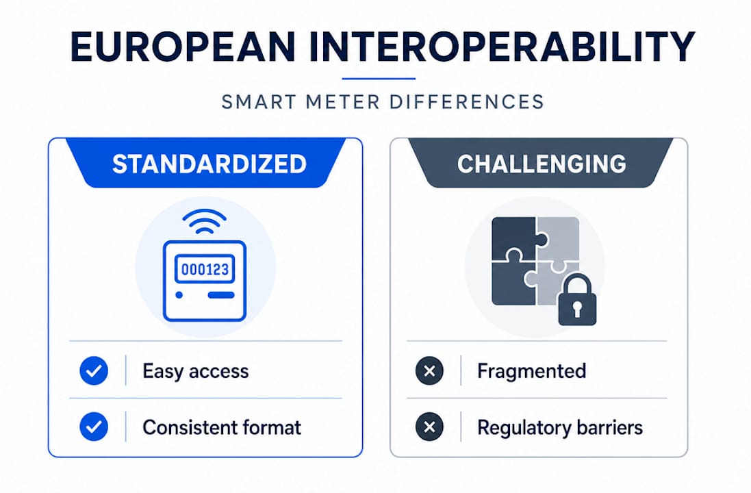
The practical consequence for a dashboard vendor or integrator is painful. A product that works perfectly in the Netherlands may need significant rearchitecting to function in Spain or Poland. Here’s a comparison of what that means in practice:
Dimension | Favorable environment | Challenging environment |
Meter data access | Standardized API via central data hub | Proprietary utility portal, manual export |
Data granularity | 15-minute intervals, real-time push | Daily totals only |
Interoperability | Common protocols (DLMS/COSEM) | Country-specific or utility-specific formats |
Switching speed | Target: 24-hour supplier switching | Days to weeks |
The EU’s Implementing Regulation (EU) 2023/1162 is a meaningful step toward fixing this. It creates a framework for standardized metering data access across member states, which directly enables the kind of interoperable dashboards that European energy users need. But regulatory frameworks take time to embed in practice.
For users, the implication is straightforward:
Ask your dashboard provider which countries and meter types their platform supports natively.
Confirm whether your local utility exposes data via an API or requires manual downloads.
Factor in integration costs when comparing platforms, not just license fees.
Silent failures in dashboard integration caused by country-specific regulatory interpretations are common. They show up as missing data points, incorrect timestamps, or KPIs that look reasonable but are calculated on incomplete inputs.
Dashboards as tools for sustainability and grid flexibility
Reducing your energy bill and reducing your carbon footprint are not separate goals. They move together, and a good dashboard measures both. Modern dashboards report kWh consumption, estimated cost savings, and carbon footprint in kg CO2 equivalent side by side. This matters for businesses facing ESG reporting requirements and for households that want to track their actual environmental impact rather than guess at it.
Grid flexibility is the next frontier. As solar and battery storage become standard in European homes and commercial buildings, dashboards take on a coordination role. They need to show not just what you’re consuming, but how your consumption relates to grid conditions, tariff signals, and your own generation and storage assets. Grid management dashboards combine metrics for capacity, generation, demand, and transmission constraints so operators can see when it’s cheapest and cleanest to draw from the grid versus self-consume from storage.
For a business with rooftop solar, a battery system, and a dynamic tariff contract, the dashboard becomes a financial tool. It shows you when grid prices are low enough to charge your battery, when your solar is producing more than you need, and whether exporting to the grid or shifting load to off-peak hours makes more financial sense. That’s data analytics for energy at work, and it produces measurable savings.
You can see how this connects to grid flexibility opportunities that many European energy users are only beginning to explore. The dashboard is what makes those opportunities visible enough to act on.
A few practical sustainability applications worth knowing:
Tracking energy intensity per unit of production to separate efficiency gains from output changes.
Monitoring peak demand to reduce capacity charges on commercial tariffs.
Documenting consumption reductions for carbon reporting frameworks like GHG Protocol or ISO 50001.
Using real-time solar yield data to maximize self-consumption and minimize grid draw during peak pricing hours.
How to adopt an energy dashboard effectively
Choosing the wrong dashboard is easy. Most platforms look good in demos and underdeliver in production. Here’s how to avoid the common mistakes:
Define your goals first. Are you trying to cut costs, meet a sustainability target, qualify for a green certification, or all three? Your goals determine which energy dashboard features actually matter.
Audit your existing data sources. Know which meters you have, what data they expose, and at what interval. A dashboard is only as good as the data feeding it.
Plan your rollout in phases. Start with electricity data, get your team using it consistently, then add solar, battery, gas, or water layers. Trying to integrate everything at once usually results in a messy, underused system.
Match refresh rates to decisions. Operations staff need near-real-time data. Finance teams reviewing monthly budgets do not. Configuring views by persona avoids information overload and increases actual usage.
Validate your time-series data. Mismanaged timestamps and duplicate intervals distort KPI calculations in ways that are hard to spot and lead to wrong decisions.
Train users on what to do with the data. The gap between seeing a spike on a chart and knowing which equipment to check is where most dashboards fail in practice.
Pro Tip: Ask for a 30-day trial with your actual meter data before committing to any platform. How a dashboard handles your specific data sources and tariff structure tells you far more than a vendor demo ever will.
My take on where dashboards are heading
I’ve worked with enough energy system deployments to say this with confidence: the biggest limitation on dashboard value right now is not the software. It’s data access.
In my experience, teams spend more time fighting meter APIs and data format inconsistencies than they spend actually analyzing energy patterns. The visualization tools have gotten genuinely good. The underlying data infrastructure in much of Europe has not caught up. Harmonizing data access across EU member states, which is what the 2023/1162 regulation is working toward, will do more for dashboard usefulness than any new chart type or AI feature.
The other thing I keep seeing is the engagement gap. A dashboard gets implemented, looks impressive during the first review, and then gets ignored after six weeks because no one assigned clear ownership of acting on its alerts. The technology is not the bottleneck. The workflow around it is.
What I find genuinely exciting is the convergence of real-time energy management with automated battery dispatch and dynamic tariff optimization. When a dashboard doesn’t just show you that grid prices are high but automatically shifts your battery discharge to cover that peak, it stops being a monitoring tool and becomes an active energy management layer. That’s the version of energy dashboards worth building toward.
— Marc
How Belinus brings dashboards to life for European energy users
If you’ve recognized your own situation in this article, Belinus has built the infrastructure to close the gap between seeing your energy data and doing something useful with it. The Belinus Energy Management System integrates solar PV, battery storage (including the Energy Wall G1 with 16 kWh graphene supercapacitor capacity), and EV charging into a single platform with a native mobile app and web dashboard. The EMS runs 15-minute dynamic tariff optimization, battery arbitrage, and real-time grid services automatically. You don’t just watch the data. The system acts on it. Explore how Belinus energy management can work for your home or business.
FAQ
What is the role of energy dashboards for homes and businesses?
Energy dashboards aggregate consumption data from smart meters, sensors, and energy systems to provide real-time monitoring, trend analysis, cost tracking, and automated alerts. They turn raw data into decisions that reduce waste and lower bills.
How do energy dashboards work technically?
Dashboards pull data from meters, inverters, batteries, and building systems at set intervals, from real-time to 15 minutes, then normalize and visualize it as KPIs, charts, and alerts tailored to different user roles.
Why is interoperability a challenge for energy dashboards in Europe?
Three different smart meter infrastructure approaches exist across EU member states, creating incompatible data formats and access methods that increase integration costs and complicate cross-border dashboard deployments.
What energy dashboard features matter most?
The most impactful features are demand alerts for anomaly detection, KPI tracking against targets, carbon and cost reporting, and multi-source data integration covering solar, battery, and grid consumption in one view.
Can an energy dashboard reduce my electricity bill?
Yes. Dashboards surface demand spikes, inefficient equipment behavior, and off-peak shifting opportunities that most users miss without visibility. Businesses using real-time monitoring have documented savings well above 30%.
Recommended
Comments